

Top 10 Cohort Analysis For Retention Improvement Icon PowerPoint Presentation Templates in 2026
Cohort analysis is a powerful technique used to improve customer retention by examining the behavior of groups of users over time. By segmenting users into cohorts based on shared characteristics or actions, businesses can identify patterns and trends that may not be visible in aggregate data. The Cohort Analysis for Retention Improvement icon serves as a visual representation of this analytical approach, making it easier for teams to communicate insights and strategies derived from their data.In practice, cohort analysis allows organizations to track the performance of specific user groups, such as those who signed up during a particular month or those who interacted with a specific feature. By analyzing metrics like retention rates, engagement levels, and conversion rates within these cohorts, businesses can pinpoint areas for improvement. For instance, if a particular cohort shows a drop in retention after a specific update or feature release, it signals the need for further investigation. This insight can lead to targeted marketing campaigns, product enhancements, or customer support initiatives designed to re-engage users and enhance their overall experience. Ultimately, utilizing the Cohort Analysis for Retention Improvement icon within presentations can help stakeholders visualize the importance of data-driven decision-making in fostering long-term customer loyalty.


Cohort Analysis For Retention Improvement Icon
Introducing our premium set of slides with Cohort Analysis For Retention Improvement Icon. Ellicudate the three stages and present information using this PPT slide. This is a completely adaptable PowerPoint template design that can be used to interpret topics like Analysis, Retention, Improvement. So download instantly and tailor it with your information.

Try Before you Buy Download Free Sample Product
 Save Hours of Time
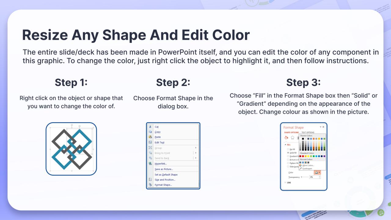
 100% Editable
 Compatible with Google Slides
-
Product Description

-
Our Cohort Analysis For Retention Improvement Icon are topically designed to provide an attractive backdrop to any subject. Use them to look like a presentation pro.